The most significant interface to our system is by far the query-construction interface. This is the first page that comes up when a user lands on the engine’s webpage, and it encapsulates the core functionality of the system: to take in user specified attributes and provide back a list of matching results.
The interface is a bit tricky in a few significant ways. Firstly, there are potentially tens of attributes of games that we could surface as options. Fortunately, we have our experts to narrow down these attributes to the relevant ones. Secondly, each attribute has a different domain of values that are permissible. There’s no way around this one; we’ll have to build input selectors that match for each attribute. Thirdly, even with the reduced list of attributes, the user will still likely only care about a subset of them. We’d prefer if the user only had to interact with those attributes that he considers relevant to what he’s looking for.
This last issue brings us to the design of the interface. After some thought, I proposed to the team two layouts for constructing queries:

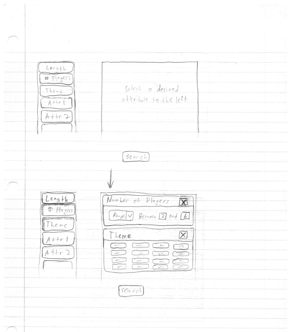
The user selects attributes to the left, then chooses the particular desired or undesired values of those attributes.

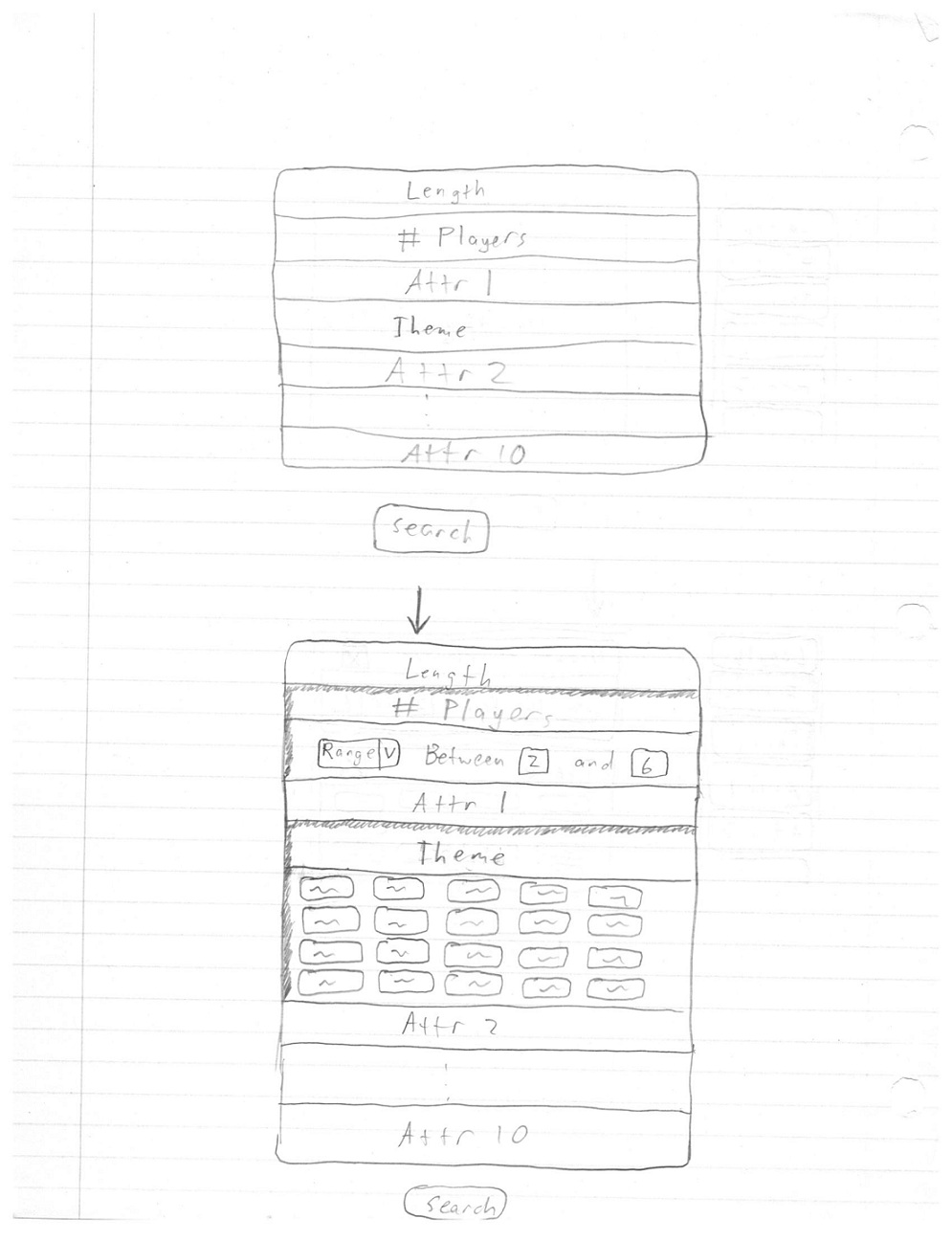
The user selects the attributes in the middle, then the area for manipulating value preferences of those attributes appears under the attribute (sliding out like an accordian).
The two styles are designed around the notion that users shouldn’t have to interact with attributes that they don’t care about. In both interfaces, the user only selects attributes that they have a preference on. It’s important to note that we intent to take into account negative preferences as well, a decision made based on feedback from our experts.
After proposing the two designs to the team, it was decided that we would go with the first design, because we believed that it looked better and utilized the space better.